Festive Winter Card
Last week our group went outside to take photos of the snow.We took different photographs of the snow for a festive winter card.I had to take a minimum of 15 photographs. Each of the photographs had to show the 'Beauty of Winter'.I had to consider careful composition -look for the best type of "lens mm" to use to best capture the scene.I had also consider the automatic camera settings,Marco Lens,Tripod and people and places. For automatic camera settings-i set the camera to manual and I set the ISO,APERTURE and shutter speed.I didn't use a Macro lens for this project and I didn't use a tripod for this project either. I didn't take any photographs of people. We took photographs of icicles,spiderwebs,footprints in the snow,snow falling,snowy trees.My favourite photographs we took were the spiderwebs and the icicles ,as the spiderwebs had detailed beautiful patterns. After, each of the members of our group made a christmas card with the photo they took.
More photos to be uploaded .......
Festive Winter Video
Last week our group also went to take a mini video.We used flip cameras to produce this 'Festive winter video',which we put on the program 'imovie'/final cut software to Festive themed music. Each of the members of the group took turns to capture a video to add to the project.I had consider the following for my winter movie;In camera editing,Steady Filming,Zooming in,Pan and Tilt.In camera editing -This is where I had to start to record a scene then when I finished filming the required length of time then I stopped recording the video.I moved to a different position an composed the shot with a different zoom setting. Steady filming -I had to be careful not to wobble the camera,as this can look awful and unprofessional . Zooming in-i had to use the zoom capability of the flip camera to add variety to the filming. Zooming out can add another dimension to my filming. Pan and Tilt- These methods can reveal a scene to the viewer,panning is the shot movement of the camera slowly from one side to another. Tilt is where the camera starts either at the top or bottom of a scene and tilts the opposite way.
Flip Camera
This is the flip camera I used to take the mini video clip. Its really easy to use as when you the press the red button it starts to record and to stop recording you press the red button again.
Pages
▼
Wednesday, 15 December 2010
Thursday, 9 December 2010
Javier Vallhnrat-Fashion photographer :)
Janvier Vallhonrat was born in 1953 in Madrid Spain.He is a fashion photographer.The interest of being a photographer took him to become regular contributor to British,French and Italian Vogue and The New York Times,beside many other publications.He began to work for severeal lead fashion designers,include Comme des Garcons,Jill Sander and John Galliano. He started to work for Yves Saint-Laurent,Chloe, Lancome etc from 1992, and recent years he also had experimented with film of varied advertisements.
Style of Work
His fashion photography revolved around fine arts as some of his images,the mixing of colour,light and other factors create a fine art photography and telling a timeless dream out of the picture.His colour in his photographs can vary but always displayed by a highly natural way,light creates a very comfortable fantasy scene with proper shadows.By the early 80's,his work was the prediction and the main influence for a generation who learnt that the natural hue of a garment didn't have to dictate its colour in a photograph.He brought a different way of using light,images that are more about experimenting with light.He only leans upon low-tech spotlights and gels to shape a vision of style that connect to the emotional concepts for the image.
"I think Javier Vallhnrat uses of lighting is astonishing, you can see every crinkle in the voluminous chiffon sleeve below. They remind me of photo realist paintings."
Mert Alas and Marcus Piggott-Fashion photographers :)
Mert and Marcus are Mert Alas and Marcus Piggott,fashion photographers.Their work and style is heavily infulenced and shaped the photography of Guy Bourdin.They have defined the look of the past decade and as a duo are one of the most respected and acclaimed photographers working today.Mert and Marcus,both born in 1971 in Turkey and Wales.They met for the first time in England n 1994 after worked for a brief period in completely different areas,the first in classical music and the second in graphic design.Marcus was an assistant photographer and Mert was a fashion photo modeler. After working together in photography business they decided to create a team.When they showed their first photos to "Dazed and Confused",the london fashion magazine,they immediately made the cover .
This photograph is of Diane Kruger and its frtom the september 2009 issue of interview Magazine mixies the the fashion of eyes wide shut with German military regalia.It was created with 4 lights.Since this image relies more on shadow than light,they key is acually a silver umbrella at f16(+2 stops) to camera left of Diane and slightly behind her.A large Octabank at f2.8 1/2(-2.5 stops) behind cameta serves as overall fill.Two small strip lights,both at f8,are behind Diane to the left and right.These are aimed down at the floor and provide some separation from the rear wall.This is a black and white photograph and her neck is tilted to the left and she is standing up with one arm on her hip.
Designer,Robert Cavalli has always been one who appreciated the art of the print.The cheetah print that is ,so its fitting his fall anniversary campaign features his adoration of the animal print and the ever so adored Gisele Bündchen. The model queen lights up the Desert literally in the campaign shot by Mert and Marcus.This is fashion photography at its best.From concept to the sensational imagery this campaign speaks ultra-glam and perfectly defines the Robert Cavalli brand.The Dynamic duo Mert & Marcus are behind these marvellous shots and have managed for the numerous time to capture luxurious imagery which fits for fashion.
Saturday, 4 December 2010
Flip camera and Sony HDR FX1
This is one of the video cameras that we will be using to take a video outside, it is an Sony HDR-FX1. This video camera is high definition video handycam with 3 x 1 Megapixel. It also has a 12x optical zoom.
We have been asked to produce different shots on theses video camera's. such as:
We have been asked to produce different shots on theses video camera's. such as:
- Pan shot from left to right and then a different shot from right to left
- Close up shot of someones face.
- A wide angle shot
- A tilt shot from high to low and then a different shot from low to high.
- A shot which manual focuses on a person walking towards the camera and retaining focus.
- A pull focus shot.
I think that the flip camera was easier to hold, as its smaller and lightweight, however the Sony HDR-FX1 was more beneficial because you had far more manual control than using the flip camera. Although using the flip camera has its advantages, its small and very light weight but the quality of the final video is not that good.
Sony HDR-FX1- Pro's - Much more control- More manual features- Better quality when filming.
Con's- Heavy- Not easily accessible.
Flip Camera- Pro's- Lightweight- easy to use- User friendly
Con's- Lesser quality of videos.
Wednesday, 1 December 2010
Studio: Wednesday 1st December :)
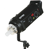
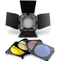
We went in the studio to take some photographs and to experiment with different lightning and we also experimented with the coloured gels. The camera we used was a Canon 5D Mark . The main lighting we used was a three in on grid defuser with a honey comb. We also used a colour gel on the background.
 3 in 1 Diffuser (Above)
Barn Doors - Honeycomb gel set (Below)

This photograph looks too dark, as the model was either standing in the wrong place or the lightening settings needed be adjusted so this would photograph would be better quality. I could of adjusted the camera angle maybe be to make the light hit the model where it should do.
I think this is quite a good photograph, as the blue colour gel looks clear and of high quality. This photograph is more clearer than the first one, as the lighting hits the model in the right place.
The equipment I used:
Bowen 500w Gemini Lighting (Below)

Barn Doors - Honeycomb gel set (Below)

Tuesday, 30 November 2010
Wednesday, 24 November 2010
More Location shoots :)
Here are the location photographs that I took.I took different pictures in different locations..

This photograph wouldn't work well, as a location, as there is too much going on in the photograph and its a bit too dark. The location for the video should be kept simple and not too busy, as it will distract people watching the video, they won't be focusing on the people that will be in the final video.

I think this may look quite good for a location shoot, as I like the texture of the leaves on the trees. I like how the path narrows and goes smaller, as it makes the composition stronger. But I still think that this wouldn't work well, as a location shot for out video, as it is a bit too dark and I think there needs to be more colour and contrast to this photograph to make it good quality.

I quite like this photograph as well for a location shot. It would especially look good if our group were to do a urban hip hop street style, as the graffiti would add a visual appealing effect. I also like the different textures and patterns in this photograph. However the bright light at the top of this photograph looks too bright and it makes the photo poor quality.

I took this photograph near the library. I like the different textures in this photograph, as the trees add good texture and even colour from the blossom is quite vivid in this photo. I like how where the lighting is on the blossom tree as it looks visually appealing. This photograph is wide depth of field, as I made sure that everything was in focus and I changed the size of the aperture to high number f.22. I think this would be a very good location for our video, as the foreground is simple and the background is more detailed and its more brighter.

This photograph is narrow depth of field which is basically just fragment of the scene. I changed the size of the aperture to a lower number -f.4.5. I like this photograph, as it adds a good sense of perspective. The first motorbike helps provide some framing. I like this photograph, as there is different textures and lighting which makes the photo look eye-catching and visually appealing.
Katy Perry Fashion Style :)
Katy Perry is known for her unique fashion style.Her fashion style is easily recognizable and her outfits are well put together. She adds a bit of a twist to her outfits by accessorizng with big bows and strong vivd colours. In this photo of Katy perry wearing a polka dotted skirt with red high heel shoes and a pale pink top.This photo enhances her very cute,girly vintage look.Over the years shes adopted her colourful and vintage style to create a unique look that is a little eccentric.The accessories she wears are very fun and coloured.She frequently uses fruit-shaped accessories,mainly watermelon,as part of her outfits.Johnny Wujek,Perry's stylist,described her style as "very colourful and vintage"


Tuesday, 23 November 2010
Logo idea for our album cover
This is the album cover we are going to use for our group stop motion video.We all thought of ideas for the album cover.The drawing of the girl is katy perry.The sweets,cakes and candy cane are on the album cover.This is because in one of Katy Perry's music videos "California girls" they have cakes,gummy bears,ice creams,sweets and candy canes etc.
Thursday, 18 November 2010
Studio photographs :)
Today we took photographs in the studio for our big music video. I took photographs of Leah Christina these are a few photographs I took of her.
These are the photographs I took of Leah. I like these photographs, as the lightning is in right place, so the photograph is better quality. I like the first photograph better, as its a better pose. I think I could of tried to have the model sitting down or doing a completely different pose to make it more interesting.


Someone from our group adjusted the lightning and the camera angle on the tripod for this photograph. They adjusted the camera, so the lightning is at the right angle for the position of the person. This photograph is of me sitting down, so the tripod will have to be adjusted so its lower down. I like the first photograph of me sitting down, as its a different pose from the other photographs. I also like the first photograph, as the lighting makes it look better quality. The second photograph looks a bit too bright and the camera should have been adjusted lower so it didn't get the top part of the background.
This is the group photograph that Sam Nellist took. I like the second photograph better than the first, as the second photograph is closer up and its clearer. The photograph is also better quality and I think the poses that we are doing look better in the second photograph.
Wednesday, 17 November 2010
Peter Lindbergh-Fashion photographer :)

Peter Lindbergh(born November 23,1944) is a German fashion photographer. He is considered to be one of the world's best fashion photographers, particularly in black and white.He is also credited taking the photographs of supermodels in the 1990's. The image on the left is in black and white.
This photo is of Kate Moss in black and white and her eyes stand out.It was taken on a grey background. This model is posing to show the bangle on her wrist as it is an advert .I can tell its advert as "David Yurman" is an american designer jewelry company.The photographer prefers his models to have minimal makeup and a simple hairstyle.These photographs by contrast are simple,elegant and stunning.Peter's work developed in a completely different direction:Powefuk black and white photographs,rich in contrasts.The dramatic style of his photo series is the result of interest in cinema: his work contains references to directors from Fritz Lang to Jim Jarmsch.
Here are some other photographs he took:


I like the pose of the first photograph with the woman looking down and and her fingers on her lips. This is a black and white photo. I think this is a really good close up of the woman doing the pose, as it shows her top and jewelry really well. I like the lightning on this photograph, as the light hits her face, neck and even a bit of her arm where the watch is.
The second photograph is also in black and white. I like how this photograph has a light background and the photo is dark. I also like the pose of the woman smiling and with one eye covered with the hat. I think the lightning is very good quality in this photograph, as the light hits her face and neck. I like the decorative patterns on her top, as they look visually appealing an eye-catching.
The third photograph is of a Dior advert. I like how this photograph is different from the rest, as its not black and white. I like the background of this photo, as it stands out. I like the lightning in this as its bright and makes the woman's face stand out.
This is photograph of Beyonce Knowles.The photo is in black and white apart from the outfit what she's wearing ,which is in colour. This makes the outfit/costume stand out against the dark background. I like the lightning of the background of this picture, as it shows an visually old looking wall and the shadows in the background emphasize Beyonce's outfit even more.
You can tell how famous a photograph is by looking at the photos it inspired.The above picture,of Lisa Fonssagrives at the Eiffel Tower is one of such photos.Translucent and temporary pose.Fonssagrives' pose was copied a number of times in fashion photography. I like this photograph, as the pose that the woman is doing with her eyes staring down and her holding her dress and standing on the Eiffel Tower. I think the pose looks really effective and visually appealing. The photograph looks eye-catching and it stands out.
In 2008,Peter Lindbergh revisited the scene with Marion Cotillard for Dior handbag advertisement(see below).
I like this photograph of a Dior Advert. The pose that the woman is doing is of her standing on a building with one hand on the building and her eyes are standing at something ahead. I like this photograph, as the lightning in this photograph looks bright and the light hits her face and the sky which makes the photo look effective. I like the background of this photograph, as its of really small buildings that are blurred out and the sky looks visually appealing. I think the overall photograph looks eye-catching and appealing.
Patrick Demarchelier-Fashion Photographer :)
 |
| This is black & white image |
Patrick Demarcheller was born near paris in 1943 to a modest family,he spent his childhood in Le Havre with his mother and four brothers.In 1975,he went to New York where he discovered fashion photography by working as a freelance phtographer and learning and working with photographers such as Henri Cartier-Bresson,Terry King and Jacque Guilbert.He Later worked for Vogue and Harper's Bazaar,first in september 1992 which resulted in a 12-year collaboration.The black white photo on the left is of Alyssa Nicole Pallett. She's
sitting on a chair facing the light that enhances her hair and facial features against the dark background and clothing.
sitting on a chair facing the light that enhances her hair and facial features against the dark background and clothing.
 This photo is of Sasha Pivovarova. She's not really the main focus of the photo as their are lots of different focus points.This photograph stands out as its in colour and its bright.Patrick Demarchelier captures the sophisticated look and side of Sasha.Her eyes are fixed on one thing.

These photos use a stark,semi lighted white background,which seems so refreshingly minmalist in the season of colours and busy prints.My favourites are the white and black pictures where model Alana Zimmer portrays an eccentric diva.The black hat sitting on top of the crazy hairdo(spotted on the runway at Moschino).
Mario Testino -Fashion photography
Mario Testino(born 30th October 1954 in Lima) is a Peruvian fashion
photography.
Mario Testino took this photograph of Madonna in 1998 for her ablum cover ,Miami.He also takes Madonna's portait shoots. This photo was took on a greeny blue background. Madonna is looking in one direction and her eyes are fixed onto one position. Her hair is blowing everywhere they used a fan to make hr hair wind swept.
He also took this photograph of Kate Moss.Kate Moss was the face in 1996 in Paris.This photo has been taken in black and white.It was taken on a grey background

This photograph is of Gwyneth Paltrow,Vanity fair
2000,New york.
This photo is quite bright and she has got her arms behind her head

This photograph of 'Emma Watson' that Mario took for a fashion magazine called 'Vogue'


