Here are some photographs that I took to give me an idea of what sort of design
I would want as my front cover on my CD cover.
1. 
2.

3.
4.
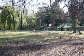
Photo 1
This photograph is close up of bushes and graffiti wall. I like the texture of the leaves in this photograph and I like the different shades of green.However it could be improved by using more of the location adding more depth to the photo and more texture to the photo to make it look more interesting and the photograph is not very clear.
Photo 2
This is a close-up photograph of a bench.I like this photo as it has different textures and different colours.I also like how its focused on the bench and it also shows different layers of lighting and contrasts in this photograph.This photo could be improved by editing the photograph on Adobe photoshop and making the photo a bit more brighter to make the bench stand out a bit more as its too dark.
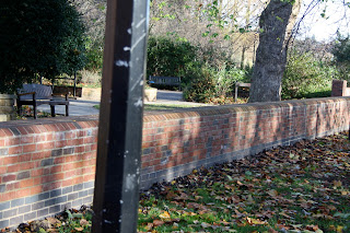
Photo 3
This is a photo of a close up of a black pole and in the background of the black pole there is a bench and trees.I like this photograph because it has different layers of lighting and texture.This photo could be improved by using a better angle/viewpoint to take the photo.
Photo 4
This photograph is of trees and ducks.Out of all these photographs I like this one because it has been taken at very good angle,it shows of the different texture of trees and ground,it shows different layers of lighting and it even shows the tracks on the ground disappearing to the corner which makes the composition stronger.
Include your experimentations with these photographs; manipulate them in Photoshop / Illustrater. Record your opinions, say what is working, what isn't and why.
ReplyDelete